We are in the intercept of design and technology.
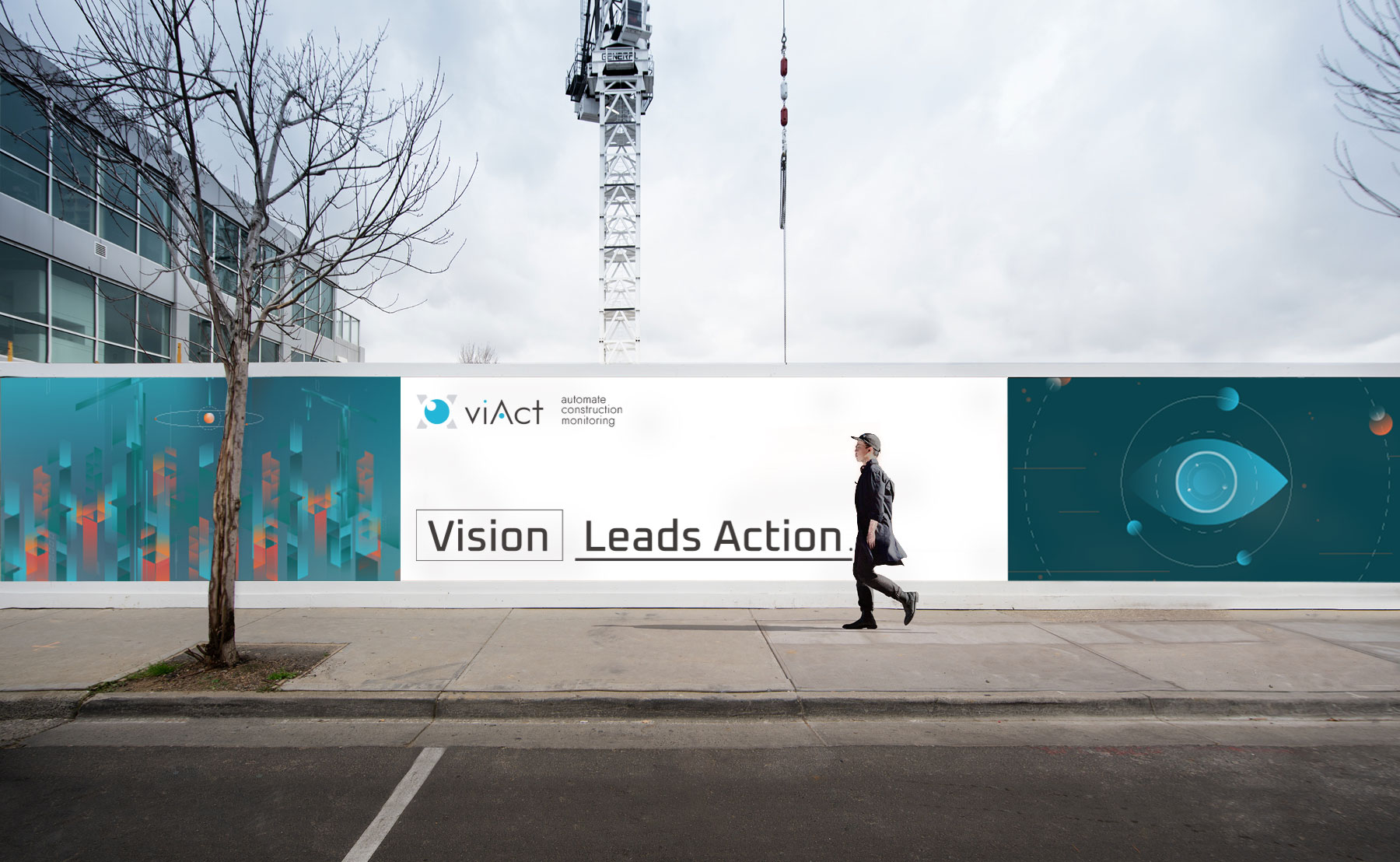

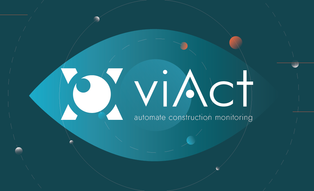
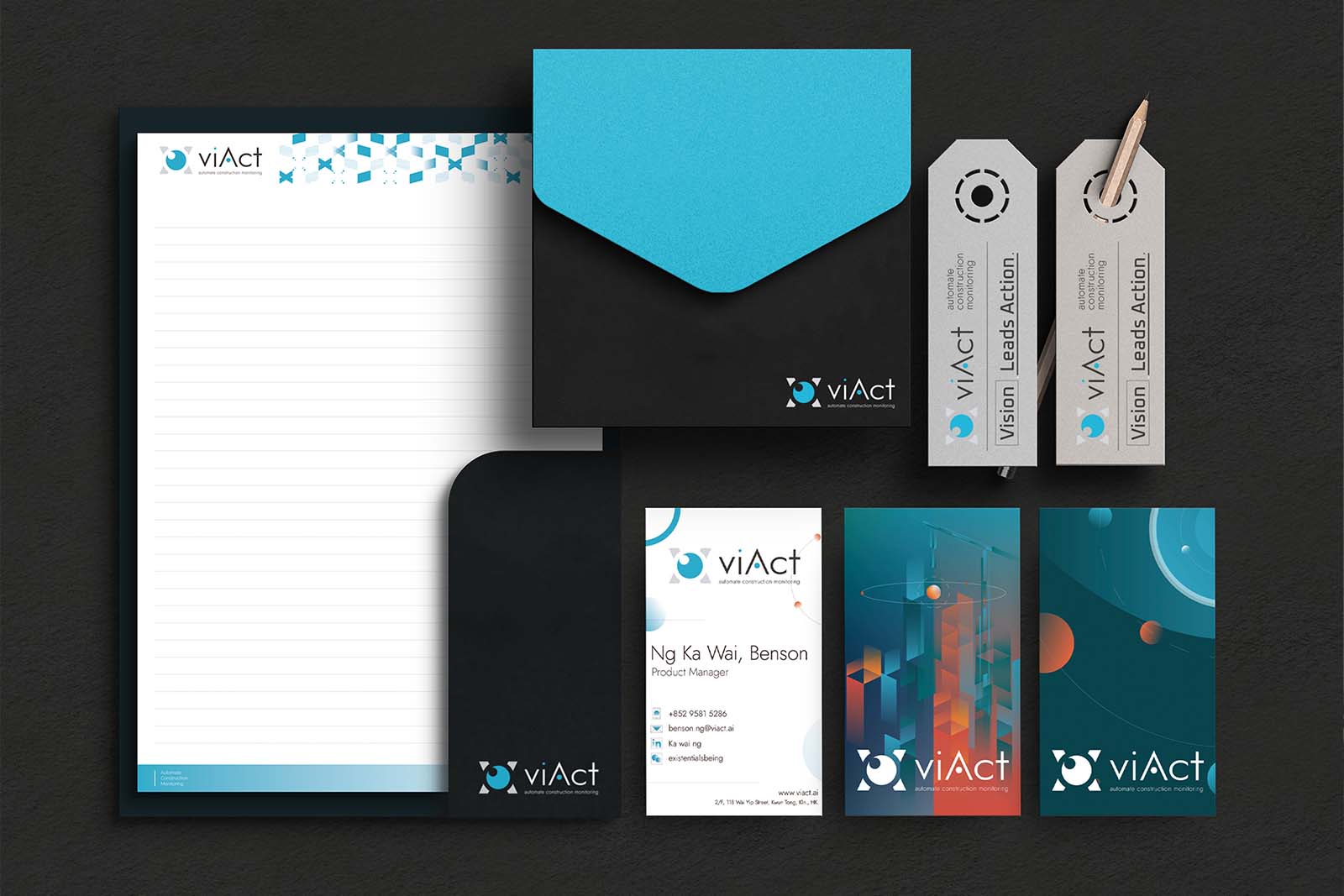
As a startup investigating intelligent architectural detection systems, ViAct looks forward to challenging the status quo and bringing dynamic technological innovation to the traditional architecture industry. Differentiating from the traditional image of the architecture industry, the use of cyan tone is anticipated to establish a distinct brand identity and set the company apart from the competition.
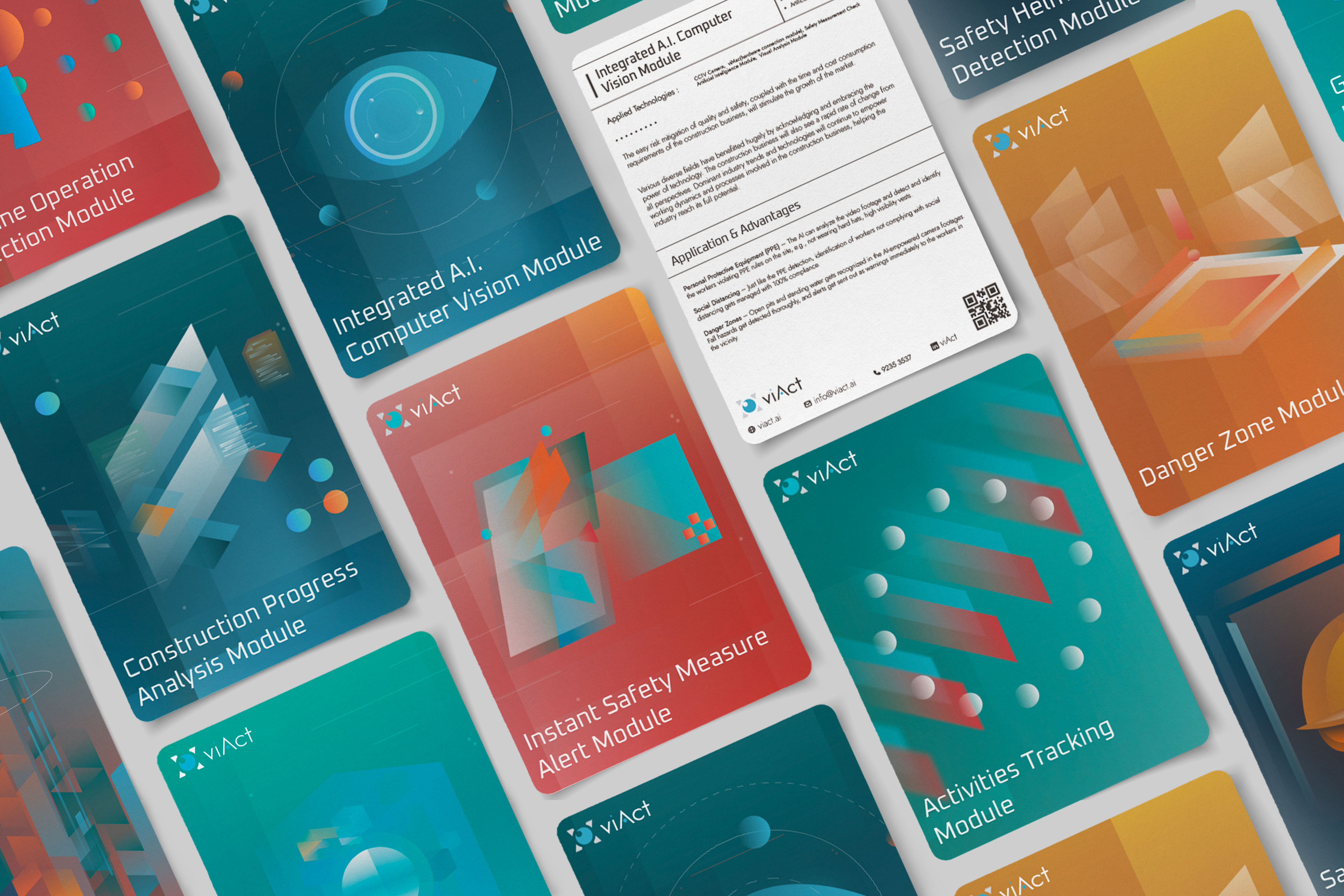
---- Visualizing Impact with No-photo Approach
To strengthen brand recognition, the advertising uses simple geometry-based 2D graphics instead of photos. This creates a distinctive identity and reflects data technology reshaping the architecture industry. The gradient suggests perspective, transparency, and control enabled by innovation.


The illustration-only approach successfully captured the audience’s attention and significantly increased digital marketing visits. The brand identity solution also received a Silver Award in the International Design Awards, confirming its success.


Creative Director : Zephyr Chum
Project Manager : Sara Au
Brand Identity : Zephyr Chum
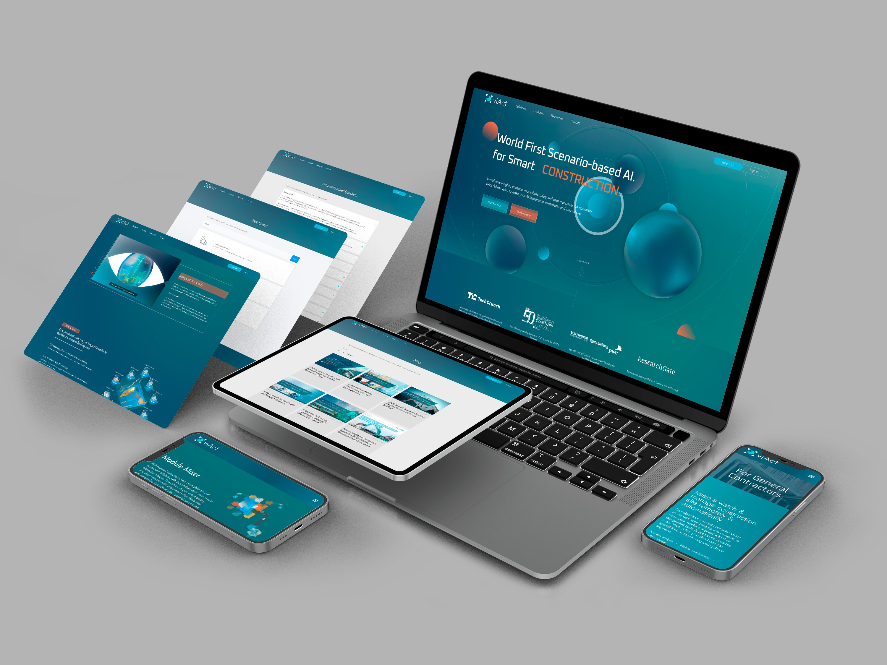
Web Design & Production : Kat Fong
Designer / Animation : Amy Yim

Please feel free to contact us if you have any questions or concern.
It provides detailed reviews of past corporate projects. Please refer to the Materials for more details.